 As promised, here’s a first interview in a series which will handle artists that have been influenced by Bob de Moor. The first is flemish artist Dirk Stallaert.
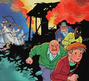
In the past Le Lombard often could rely on Bob de Moor whenever there was a need for drawings holding most if not all of the heroes in the editor’s portfolio. Bob de Moor was able to adopt every possible style, from realistic to cartoonesque. After Bob de Moor passed away Le Lombard looked for a new talent that could fill that void. With the flemish artist Dirk Stallaert (Brussel, 28 December 1955) they already knew what he was worth thanks to his excellent work on ‘Nino’ (in a scenario of Hec Leemans), which was drawn in a pure Hergé/Bob de Moor tandem style. Stallaert had used various other styles before when for example working for Jean-Pol (whose ‘Kramikse’ he mastered in no time) or releasing ‘Dionies d’ Oldenboom’ which shows the more absurd side of Stallaert.
Since ‘Nino’ (which unfortunately never got the success it deserved despite being some of the best work ever released by Le Lombard), Stallaert started to work for Merho (‘De Kiekeboes’), Marc Sleen (‘Nero’) and Studio Vandersteen where he currently resides. Flemish readers will surely have noticed his time spent on the different comics he worked on not in the least thanks to the wonderful female creatures he included, especially in ‘Nero’. Besides his work for the Vandersteen Studio he also has his own series with ‘Plankgas en Plastronneke’, ‘Mieleke Melleke Mol’ and ‘Pakkeman en Poulet’ of which a first album was (finally) released a few weeks ago. And if you can’t get enough, make sure to get hold of the ‘Kitty’ series too.
When we contact Dirk Stallaert he says that the interview request comes right on time as he is totally back into the clear line (ligne claire) mood.
BDM: What was the reason for this sudden new clear line rage?
DS: It didn’t really come fall out of the sky, but it was a gradually returning belief that the best style to pull your readers into a story is that one of Hergé, and also that one of Vandersteen during the 50s plus a few others. In short: the characters remain caricatures, but all the rest clearly isn’t, contralily to Franquin, who – in a masterful way indeed – also deforms requisites and sceneries. Although Franquin belongs for sure to the top when it comes to comic artists, worldwide and from all times, I didn’t think it was a good idea to use the through and through caricatural style which became his trademark for the last Spirou albums.
I’m easily distracted by the graphical mannerism. It remains masterly drawn work but when it comes to Tintin the drawings have – although also excellent – more of a serving purpose and I thus get very easily pulled into the story.
I already was convinced of that almost 30 years ago, after having used all kind of styles, but I wasn’t mature enough to handle that extremely difficult clear line. ‘Nino’ was a meritorious attempt, but, due to my lack of formation, by the fact that I had learned to draw in a wrong, backward way (first the deformation, the caricature, and then only much later the basis, the reality), I lost heaps of time and energy that I soon left the clear line for what it was. Now, much later, I feel way more capable to approach the Hergé style and I try to get back on the clear line path, with lots of drawing pleasure.
My problem is that I often have difficulties to choose. Despite my conviction that the Hergé style is the best to tell a story, I like it very much to let all the breaks loose and use a very loose line, with more panache, ough caricature and grotesque deformations. But I always return to the through doctrine (smiles).
BDM: Is there new work coming up that will correspond to the clean line? Or can we expect a new ‘Nino’ after all?
DS: Hec Leemans has been working on a new ‘Nino’ for quite some time, so it’s excluded I will do that. But the clear line is entering my work more and more recently in the other things I do. In ‘Mieleke Melleke Mol’ for instance; and in the more recent ‘Pakkeman en Poulet’ episodes, that was already clearly noticeable. If I would start with something new at this moment, it would clearly go into that direction.
BDM: Can you exploit that clear line urge at the Studio Vandersteen?
DS: In the Spike and Suzy album “Suske de Rat”, for which I worked on the pencil work – with exception of the scenery – it was already very noticeable to my feeling. Maybe it didn’t show all that much to the reader because the inking by Eric De Rop is more flexible and less ‘dry’, but the basis there clearly was the clear line.
BDM: What memories do you have from Bob de Moor?
DS: I first got acquainted with the work of Bob de Moor with his work for the weekly Tintin, which I bought every now and then back in the early 60s. Apart from that there were also the first “Nonkel Zigomar, Snoe en Snolleke” albums which were published in a very attractive big format and which – typically for the Flemish comics from that era – were printed on newspaper paper, alternately with a red and blue line.
I first met him in 1989, when Hec and I went presenting the ‘Nino’ comic to Le Lombard, where Bob de Moor was then the artistic director. I remember him just like everyone else who knew him, as an amiable, affable person, with absolutely no airs and graces. I met him only 3 or 4 times, and since I’m not really all that sociable and since there were always other people around doing the talking, I don’t really recall having had a very interesting chat. I do remember a roaring laugh. I once called him when I was young at the Studios Hergé. I was – and still am – a real material fetishist and I asked him with what kind of brand of East-Indian ink he worked. I probably though that once I had the same ink, that I could draw as good as he did. “It’s Pelikan” he answered gently without telling me to go to hell.
BDM: A lot of your current work leans towards the more grotesque nonsense way of working that was typical for Bob. ‘Pakkeman en Poulet’ for instance have a lot in common with for instance the “Barelli’ series where style changes throughout the stories were also typical. Or am I wrong?
DS: I suspect that Bob had the same ‘problem’ like I had: not being able to really choose between all those styles and then just regularly do digressions. But I’m not sure, I only met him a few times. The nonsens in my comics are more inspired by Marc Sleen I think. His work has been very influential, more than that of any other artist.
BDM: For the celebration of the 50th album for Tibet’s ‘Ric Hochet’ you sketched a 2-plate cartoon together with Bob de Moor. Can you remember how that collaboration started? (Editor’s note: the drawings can be seen right here)
DS: I can’t remember really well how that collaboration started. Nowadays it would be simple, Bob would draw his part and then mail it to me, after which I would add my drawings digitally. But back then that wasn’t possible. I do remember that he was the first one to draw his part of the cartoon – on the foreground – after which I added the rest on a separate sheet probably.
BDM: Have you never been asked to collaborate for other projects?
DS: We have never talked about a possible further collaboration, no. You have to realize that this took place shortly before he got ill and passed away if I remember well. I think he also had an assistant by then (editor’s note: Geert De Sutter).
BDM: It’s quite remarkable that artists who have know him, often tell how Bob never got the recognition he deserved. What’s your take on that?
DS: At a certain moment, in 1950 I think, he made a choice that influenced the rest of his life. It resulted in the fact that he never would have an own ‘big’ career. ‘Big’ as in the careers that people like Marc Sleen, Hergé and Willy Vandersteen had. He more or less chose to live in the shadow by choosing to work for the Hergé Studios. Combining that job with an own oeuvre as massive as that of Sleen, Vandersteen or Nys was just impossible. I guess he knew that really well back then.
We can only guess what could have happened otherwise. Maybe there would have been a Studio de Moor with a huge output of ‘Nonkel Zigomar, Snoe en Snolleke’, ‘Barelli’, ‘Cori’, ‘Balthazar’ albums, who knows. I don’t think he was the kind of person to put himself in the picture. That doesn’t prevent me from thinking that there should indeed be way more attention for his work than what is the case now. Without any doubt.
BDM: Bob phoned you once to say that there was something wrong with a ‘Nino’ drawing of the Brooklyn Bridge in New York in part 2 “De prinses van Manhattan”, page 11 (plate 9), the second strip? What had happened?
DS: I drew the Brooklyn Bridge and it was quite difficult and complicated, and in the abundance of crossing lines I had forgotten a part of the bridge. But it clearly was an error that had to be corrected. Bob, being the artistic director, called me and asked me indeed in a very humble tone, if perhaps pretty please, potentially, if I would want and if it wasn’t too much asked, to add that missing part. And I stood there on the phone, almost saluting (laughs)!
BDM: As you probably know, there is a chance that the uncompleted Tintin album “Thermozéro” will be released after all, albeit in an Alph-Art-esque way. Doesn’t it itch a bit to complete one page? Since Moulinsart wants to release a new Tintin album before 2052, you might just want to take the bait?
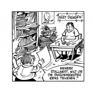
 DS: 2052 ? I better get started right now, because I work rather slowly these days. I don’t know. I once declined the offer to draw the new Blake and Mortimer. It’s actually one of the reasons why I am so ‘famous’. The man who didn’t draw Blake and Mortimer! I declined the offer, because of what I would call a cowardly fear of failure. The whole world is then watching what you do, ready to slaughter you with every line you draw. With Tintin I guess it would be even worse. Maybe I have to look up my ‘Sikje’ again, the character that I once drew in the background of a ‘Plankgas en Plastronneke’ episode. I’d be more at ease doing that!
