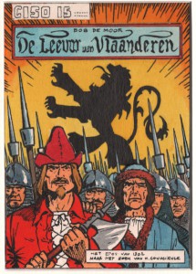
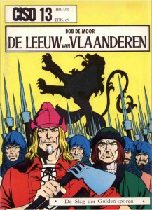
In July 1973, Bob De Moor would see his “De Leeuw van Vlaanderen” (after the historical novel written by the Flemish writer Hendrik Conscience in 1838) reissued in the CISO series, namely as CISO 13. For the occasion Bob De Moor completed a different front cover than the one used for the 1952 original and later versions, even post 1973 (such as the De Dageraad version from 1984 which was yet another version). What many don’t know however is that he first created various miniature covers, mostly in black and white, which in themselves are real pearls. But in the collection of Olivier Marin we found a test drawing, in colour…

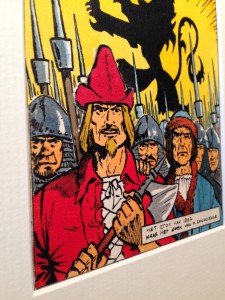
The drawing itself is quite small, more or less 15 cm x 10cm, but what especially caught my attention was the fact that De Moor had completed the drawing using cut out layers. On the left we have added a picture taken from such an angle that you can see these layers. If you look carefully, you will see that the drawing exist of 3 different layers.
The first, ground layer, represents a whole lot of goedendags next to a big lion, which stands for Flanders.

A goedendag was a weapon originally used by the militias of Medieval Flanders in the 14th century, notably during the Franco-Flemish War (also the theme of “De Leeuw van Vlaanderen”). The goedendag was essentially a combination of a club with a spear. Its body was a wooden staff roughly five feet (150 cm) long with a diameter of roughly four inches (10 cm). It was wider at one end, and at this end a sharp metal spike was inserted by a tang. The name “goedendag” derives from Dutch meaning “good day”, with reference to the Bruges Matins massacre in 1302, at which the guildsmen of Bruges purportedly took over the city by greeting people in the streets, and murdering anyone who answered with a French accent. The Flemish themselves referred to the weapon as a “spiked staff” (gepinde staf). Another theory is that it’s related to Germanic/English “dagger”, so instead of “good day” it may have meant “good dagger”. “Dag(ger)” isn’t used anymore in current Dutch, while “goedendag” is still correct in current Dutch as “good day”.

The second layer shows the Flemish soldiers, ready to attack the French oppressors. And on the front row, the 3rd layer, we see Jan Breydel and Pieter de Coninck. Both protagonists have often been portrayed as patriotic heroes in Flanders because of their passion for Flemish identity. Flemish nationalists credit them with ensuring the survival of the Dutch language in the northern part of Belgium.
But there are several differences with the final version. First of all, as you can see, the test version shows CISO 15 (that would later be Willy Vandersteen‘s Ridder Gloriana’s “De Staalblauwe Boeddha” in the CISO series). Bob De Moor would also change the lettering as used for the title. Plus the subtitle as put in the bottom of the drawing would change from “Het epos van 1302 naar het boek van H. Conscience” to simply “De Slag der Gulden Sporen”. Furthermore you will see that the style of this test drawing and the final drawing is quite different. Where the test drawing is a more sketchy approach, with very warm colours, the final cover artwork turned out to be cold offering a (over?)purified drawing style which he would later improve for the Cori albums from 1979 on. The colours in the final versions are, let’s be honest, rather boring and miss the warmth and depth from the test drawing. Other differences include a different axe in Breydel’s right hand, the missing hand of de Coninck on the left shoulder of Breydel, a few different helmets and slightly differently drawn goedendags.
Bob De Moor was a welcome guest in the CISO series under the editorial control of Danny de Laet. CISO 8 for instance had already seen the publication of another Bob De Moor chef-d’oeuvre, namely “De Kerels van Vlaanderen”.
