From 1 February 1954 until 25 May 1954 the newspapers De Nieuwe Gids, De Antwerpse and ’t Vrije Volksblad published the Snoe & Snolleke story “Het geheim van Vulcania”.
The album has since the publication in 1954 never been published in album format, at least not in its original form, black and white that is.
In 1993 the album saw a coloured album release via the Standaard Uitgeverij, however many of the drawings had been adapted to fit a coloured version – as we have shown several times already – so for many people it was still a mystery how the album actually looked like in black and white

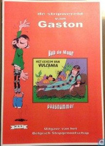
We also have to mention that a version of the black and white album had been spread by Het Belgisch Stripgenootschap, albeit in a not so good copied format, and according to our information, this version (which has been reprinted for years) is an illegal one.

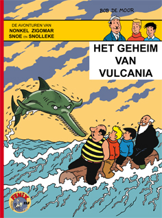
But luckily there is the team of Brabant Strip who have now released the black and white version of the album in their Fenix series, including the announcements as published in the newspapers. The album comes with a real cover on top. When looking at the cover you should be able to immediately recognise the hand of no-one else but one of Flanders (even Belgium’s) best comic artists, Dirk Stallaert (Nino, Mieleke Melleke Mol, Plankgas en Plastronneke, …).
I contacted Dirk for some feedback.
BDM: Normally it’s Bob De Moor’s son Johan who takes care of the cover artwork (after the work of his father) for the Fenix reissue series of Snoe & Snolleke. Why did you make the cover this time?
Dirk Stallaert: I honestly have no idea why Johan didn’t draw it this time. I know via Brabant Strip that he didn’t mind me drawing the cover. Maybe he just didn’t have the time for it.
(Editor’s note: In a phone call we had with Johan De Moor, he confirms that it was a lack of time but he also stresses that he was pretty sure that Dirk Stallaert was the perfect man for the job. Case proven.)
BDM: Have you chosen the scene (visible in the strips 37, 38) on which the cover is based or was it suggested to you?
Dirk Stallaert: It was Yves Kerremans from Brabant Strip who suggested to use that scene.
BDM: I suppose it’s not an easy task to invent a cover for an album, which is not yours to begin with. Were there elements in this album that made it a difficult task?
Dirk Stallaert: Aaaah, it’s always a difficult task to try and get things right. Even for my own work it’s always a difficult task to make a cover and when I have to work in someone else’s style it’s even more difficult. I have just received the album yesterday and what stands out I think is the thickness of the lines… it’s quite heavy I must say and the fish isn’t flexible enough to my taste. But like I said, there’s always something to complain about. “Le plaisir de se voir imprimé” is a pleasure which I haven’t had this time. I quite like how the sky looks though. I nicked the idea from “The Black Island”. But don’t tell anyone!
BDM: Ha, as always you have succeeded in perfectly representing the style though as used by Bob De Moor in the album, but keeping your own ‘schwung’ (the sawfish that is).
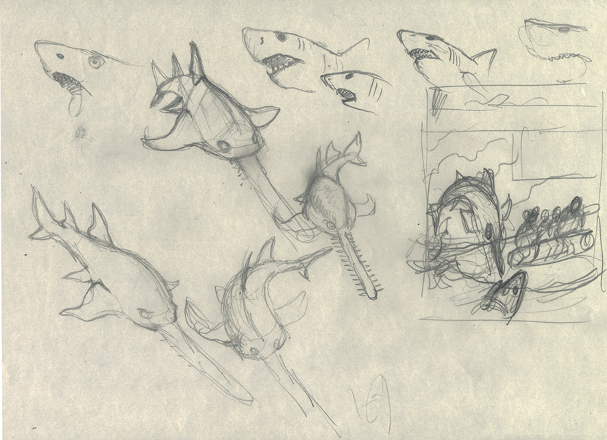
Dirk Stallaert: I’m quite glad you have discovered the ‘schwung’, because I missed that flexibility. I had documented me really well and had first made a few sketches of the sawfish.
(Editor’s note: Dirk Stallaert sent us the sketches below.)

As always the pencil sketches are a lot more fluent and expressive. The shark which you can see in the sketch didn’t make it in the final version. It’s often a problem when using the clear line, you only have one line, and that one has to be the perfect one.
