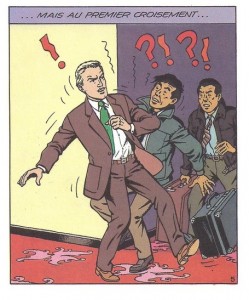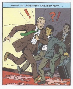
In the first edition of the Blake and Mortimer album “Professor Sató’s Three Formulae, Volume 2: Mortimer vs. Mortimer” (1990) Bob De Moor drew the last case of page 7 in a rather awkward way. You can see Captain Francis Blake running into 2 other people, but something just doesn’t feel right. The pose just doesn’t seem natural. But that – truth to be told – wasn’t entirely the fault of De Moor unlike what many think. In fact had Bob De Moor followed the picture Edgar P. Jacobs made for that pose it would have been even more theatrical. He softened the pose for the first edition of the album but in the end he (and others) felt that the choice still wasn’t the best either.

The story was also explained in the “Dossier Mortimer contra Mortimer” as published by Les Editions Blake et Mortimer and it was suggested in there that Bob De Moor should redraw the case, which he did. In the later edition this particular case would be replaced by another version by De Moor (you can see it on the left) which was way more natural (and closer to the many corner bumps in Barelli for instance). Note that the initial crayon drawing by Edgar P. Jacobs was more like the final result for the later editions. So it’s a bit weird that De Moor chose to go for the pictured pose instead…
You’ll also notice that De Moor adapted the different body part sizes in this new version, so that the characters in this case have a less large head compared to their body. We’ll get back to this in a later article when we dive into the details of how the album was exactly made and the problems Bob De Moor faced besides having to work against a fast ticking clock.
