In 1972 Bob De Moor would create “Barelli et le Bouddha boudant” (published in Tintin in 1972), the first new full Barelli album after 1964’s “Barelli et les agents secrets”. For this album Bob De Moor abandoned the sketchy way as used in “Barelli et les agents secrets” and returned to the clear ‘Tintin’ line. If you look well you’ll see a lot of similarities between the style used in the Tintin albums “Flight 714” and “Tintin in Tibet” (especially the way Indian / Pakistani people are drawn). Looking back it’s also a clear indicator of the symbiosis between Hergé’s style and that of Bob De Moor which you would find in “Tintin and the Picaros” including lots of close-ups, but more on that later.

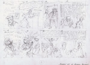
Today we present you a penciled sketch – provided to us by Freddy Oudhof – of page 4 which was made for this album and for which the pieces would in the end turn up on page 4 and 5 of the final album. On this page sketch you see 8 frames, numbered from 14 till 21. This is part 2 of a bigger page with the frames numbered from 6 till 13. Let’s have a look at what we present you today. We really advise you to take this particular Barelli album in order to follow the following explanation more closely.

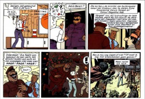
The first thing you will notice is that the action in the final version is longer than what is proposed on this first version. Frame nr. 14 in this 1st version would end up as a cliffhanger on page 4 of the album while frame nr. 15 would be deleted for the final version. Frame 16 would get a more close-up approach, and this for a particular reason. It enabled Bob De Moor to give the chauffeur of the Minister of Foreign Affairs of Kroensjir an even bigger presence by adding more stress on the large chest. Note also that originally the driver and his two bosses were wearing turbans (see the following frames where it wasn’t really erased). Frame 17 has a few differences compared to the final version. Not only is the chauffeur on this first version behind Barelli, the text is also different. In this first version the Minister of Foreign Affairs introduces himself whereas in the final version the chauffeur would do the introduction, something which is more official of course. You’ll also see that in this first version the Minister of Foreign Affairs has a less pronounced nose. Frame 18 and 19 follow the album version although frame 19 has a better graphical overview in the final version. Frame 20 is completely different. From a frog’s perspective Bob De Moor switched to a bird’s eye view which is way more interesting visually. The reason is simple. In the end Bob De Moor realized that he was able exposing the 4 men below way better in a bird’s eye view than in a frog’s perspective. It also made the drawing way less ‘packed’ than in the first version. You’ll also see that the text in the first version is different to the final version. Finally, frame 21 not only has a different setting (the original version is at Barelli’s front door while the final version locates the 3 men inside Barelli’s home) it also has a completely different text. Frame 21 would also be placed on a different strip compared to this first version.
The final thing you will notice is that all the texts are in French. Indeed, Bob De Moor wrote the Barelli’s in French first after which they were translated into Dutch, albeit not by De Moor. It would result in some really bad Dutch translations, but we’ll focus on this in another article where the worst examples will be showcased. A reason more to enjoy this series first of all in its French version. A final detail, the original title for this album, “Barelli et le Bouddha boudant”, was already known in an early stage as you can see in the bottom left corner.
